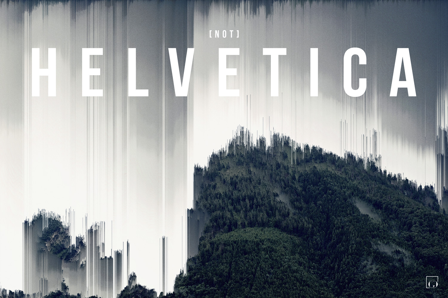
not helvetica was my first design i had printed, it was a milestone for my design career and confidence in my growth as a designer. helvetica, being one of the most popular and widely used typefaces in the world stands as a design norm. the message behind this piece is to always stay true to who you are, even if it means going against what’s popular.
not helvetica was my first design i had printed, it was a milestone for my design career and confidence in my growth as a designer. helvetica, being one of the most popular and widely used typefaces in the world stands as a design norm. the message behind this piece is to always stay true to who you are, even if it means going against what’s popular.
additional information
30 x 20 in
9000 x 6000 px
300 dpi
rgb color space

